Step into the world of interior design, where colors hold the key to transforming spaces and evoking emotions. Have you ever wondered why certain rooms make you feel energized and alive, while others invite you to unwind and relax? It all comes down to the fascinating realm of color psychology. Choosing the right color palette for your interior design is not just about aesthetics—it’s about creating an environment that aligns with your desired mood and ambiance.
In this captivating journey, we will explore the captivating realm of color psychology, unravel the meanings behind different hues, and uncover the secrets to crafting a harmonious color palette that resonates with your unique style. Get ready to unlock the power of colors and unleash the full potential of your living spaces.

Understanding Color Psychology
Color psychology plays a pivotal role in home interior design, as it has the power to influence our emotions, moods, and overall experience within a space. By understanding the basics of color psychology and its application in design, you can create harmonious and engaging environments that resonate with the inhabitants.
When exploring color psychology for home interior design, it is essential to delve into the psychological associations and meanings of different colors.
Warm Colors and Their Effects
- Red: This vibrant color is associated with passion, energy, and excitement. It can create a sense of warmth and intensity, making it suitable for social spaces like dining rooms or areas where you want to stimulate conversation and activity.
- Orange: With its cheerful and invigorating nature, orange promotes enthusiasm and creativity. It can add a welcoming and energetic touch to areas like home offices or creative spaces.
- Yellow: The color of sunshine, yellow exudes positivity, happiness, and optimism. It can brighten up any room and create a welcoming and uplifting atmosphere, making it ideal for kitchens, entryways, or areas where you want to evoke a sense of joy.
Cool Colors and Their Effects
- Blue: This calming and serene color is associated with tranquility and relaxation. It can create a soothing ambiance, making it suitable for bedrooms, bathrooms, or areas where you want to promote a sense of peace and serenity.
- Green: With its connections to nature and growth, green brings a refreshing and harmonious vibe to a space. It can create a sense of balance and rejuvenation, making it a great choice for living rooms or spaces where you want to foster a connection with the outdoors.
- Purple: Associated with luxury and creativity, purple brings a touch of elegance and sophistication to a room. It can create a sense of opulence, making it suitable for areas like master bedrooms or spaces where you want to evoke a sense of creativity and imagination.
Neutrals and Their Effects
- White: Symbolizing purity and cleanliness, white is a versatile color that can create a sense of spaciousness and simplicity. It can serve as a backdrop to highlight other colors or be used alone to create a minimalist and serene environment.
- Gray: With its versatility and timeless appeal, gray brings a sense of sophistication and neutrality to a space. It can serve as a versatile foundation that pairs well with various colors, making it a popular choice for living areas or areas where you want to create a modern and elegant atmosphere.
- Beige: This warm and comforting neutral creates a sense of coziness and simplicity. Beige is often used as a calming backdrop in bedrooms or living rooms, allowing other elements in the room to take center stage.

When interpreting color psychology in home interior design, it is crucial to consider personal preferences and cultural influences. Everyone has unique associations and emotional connections to colors based on their background, experiences, and cultural upbringing. Understanding and respecting these individual and cultural nuances will help you create personalized and meaningful spaces that truly reflect the occupants’ tastes and create a harmonious environment.
Creating a Harmonious Color Palette
Color harmony is a fundamental principle in interior design, as it ensures a visually pleasing and balanced composition within a space. By understanding the significance of color harmony, designers can create cohesive and engaging environments that evoke the desired emotions and atmosphere.
When exploring different color schemes, it’s essential to consider their characteristics and how they can be applied to various spaces or design styles.
Monochromatic Color Scheme
A monochromatic color scheme revolves around a single hue, varying in saturation and brightness. It creates a sense of simplicity, elegance, and unity.
Examples: A serene bedroom with varying shades of blue, a modern living room with different tones of gray, or a minimalistic kitchen with different shades of white.
Analogous Color Scheme
An analogous color scheme involves colors that are adjacent to each other on the color wheel. It creates a harmonious and cohesive look, as these colors share similar undertones.
Examples: A cozy living room with warm tones of orange, red, and yellow, or a tranquil bathroom with soothing shades of green and blue.
Complementary Color Scheme
A complementary color scheme pairs colors that are directly opposite each other on the color wheel. It creates a vibrant and dynamic contrast, adding visual interest and energy to a space.
Examples: A bold and dramatic dining room with a combination of deep blue and vibrant orange, or a lively kitchen with a mix of purple and yellow accents.
Triadic Color Scheme
A triadic color scheme consists of three colors evenly spaced on the color wheel. It offers a balanced and vibrant combination, creating a visually striking effect.
Examples: A cheerful nursery with pastel shades of yellow, blue, and pink, or a lively home office with pops of green, orange, and purple.

By applying these color schemes to different spaces or design styles, you can achieve varied effects
- A monochromatic scheme in a contemporary living room creates a sleek and sophisticated atmosphere.
- An analogous scheme in a coastal-themed bedroom evokes a sense of tranquility and relaxation.
- A complementary scheme in a vibrant and eclectic kitchen brings energy and personality.
- A triadic scheme in an artistic studio space adds vibrancy and creativity.
Remember, selecting the right color scheme depends on the intended mood, purpose of the space, and the desired style. Experiment with different combinations, consider the natural light in the room, and trust your instincts to create a harmonious color palette that elevates the overall design.
Factors to Consider when Choosing Colors
When selecting colors for your home interior design, there are several important factors to consider that will greatly influence the overall look and feel of your space. By taking these factors into account, you can make informed decisions that result in a cohesive and visually pleasing design.
Here are key considerations to keep in mind:
Lighting and Natural Light
- Lighting plays a crucial role in how colors are perceived. Consider the amount and type of lighting in the space, as it can affect color intensity and undertones.
- Natural light can vary throughout the day, impacting how colors appear. Test your color choices in different lighting conditions to ensure they maintain the desired effect.
Size and Purpose of the Space
- The size of the space is an essential factor in color selection. Lighter colors can make a small room feel more spacious, while darker colors can create a cozy and intimate atmosphere in larger spaces.
- Consider the purpose of the space when choosing colors. For example, calming and soothing hues work well in bedrooms and bathrooms, while vibrant and energetic colors can be suitable for areas like home offices or playrooms.
Existing Elements in the Room
- Take into account the existing elements in the room, such as furniture, flooring, and architectural features. Consider how the colors will harmonize or contrast with these elements.
- If you have a focal point in the room, such as a statement piece of furniture or artwork, choose colors that complement and enhance its presence.
Balancing Bold or Vibrant Colors with Neutrals
- Bold or vibrant colors can add personality and visual interest to a space, but it’s important to balance them with neutrals for a cohesive look.
- Use neutral colors as a base to create a sense of harmony and to allow the bold colors to stand out without overwhelming the space.
- Consider using bold colors as accents or focal points, such as through accessories, accent walls, or statement pieces of furniture.
Personalizing Your Color Palette
When it comes to choosing colors for your home interior design, it’s important to embrace your own personal taste and self-expression. Your color palette should reflect your unique style and create a space that feels truly yours.
Here are some considerations to personalize your color choices:
Self-Expression and Personal Taste
- Don’t be afraid to trust your instincts and choose colors that resonate with you personally. Your home should be a reflection of your individuality and personal style.
- Consider the colors that you are naturally drawn to and feel a connection with. These colors will evoke positive emotions and create a space that feels inviting and authentic to you.
Cultural and Emotional Connections
- Colors hold cultural and emotional significance, so consider your cultural background and personal associations with certain colors. For example, vibrant reds may symbolize luck and prosperity in some cultures, while cool blues may evoke a sense of calmness and serenity.
- Explore the meanings and symbolism associated with different colors and choose hues that align with the mood or atmosphere you want to create in your space.
Using Accent Colors and Statement Pieces
- Accent colors can add pops of visual interest and personality to your space. Choose one or two accent colors that complement your main color palette and use them strategically throughout the room.
- Incorporate accent colors through accessories, such as throw pillows, artwork, rugs, or decorative objects. These pops of color will create focal points and add depth to your overall design.
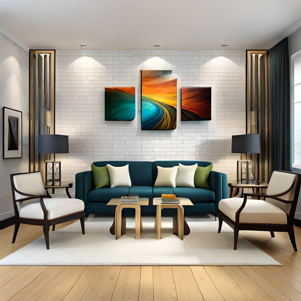
- Consider incorporating statement pieces, such as a bold-colored sofa or an eye-catching piece of artwork, to create a wow factor and infuse your space with personality.
We can conclude
As you embark on your interior design journey, armed with the knowledge of color psychology, let your creativity soar and your spaces come alive. Remember, the right color palette has the remarkable ability to shape your emotions, energize your spirits, and create a harmonious atmosphere that speaks to your soul. Whether you opt for soothing blues to cultivate tranquility or vibrant oranges to ignite passion, the choices you make will leave a lasting impression on both you and your guests.
So, dare to experiment, embrace the power of colors, and let your imagination run wild. Allow your interior design to reflect your personality, evoke the desired mood, and transform your living spaces into personalized works of art. Get ready to paint your world with hues that ignite joy, inspire creativity, and bring your vision to life.
Design your dream house with Exqsite
20 years of professionals experience
In Exqsite, our team of 20 years of professional experience will make your house beautiful and functional in every aspect, with an eye on detail and perfection. We guarantee you will be satisfied! Here are things that you will get from us:
- We provide high-quality workmanship at reasonable prices
- We put our clients first by serving them friendly customer service
- Employees with over 20 years of experience
Make your renovation situation easier with us. Click here or visit our showroom at 8 Boon Lay Way Tradehub21 #01-18 Singapore, Singapore 609964 for the solution to your renovation problems.
Frequently Asked Question
1) How does color psychology impact interior design?
Answer: Color psychology is the study of how colors affect human behavior and emotions. In interior design, it plays a significant role in creating specific moods and ambiance within a space. By understanding the psychological associations of different colors, designers can strategically choose palettes that promote relaxation, productivity, or creativity, depending on the intended use of the room.
2) How do I choose the right color palette for my interior design?
Answer: When selecting a color palette, consider factors such as the purpose of the space, personal preferences, existing elements in the room, and the desired atmosphere. Look into different color schemes, such as monochromatic, analogous, complementary, or triadic, and explore how they can harmonize with your design goals. Experiment with sample swatches, test the colors in different lighting conditions, and trust your instincts to find a palette that resonates with your vision.
3) Can colors affect the perception of room size?
Answer: Absolutely! Colors have the power to visually alter the perception of space. Lighter colors, like whites and pastels, can create an illusion of openness and make a room feel larger. On the other hand, darker colors, when used strategically, can add depth and create a cozy atmosphere in larger spaces. Understanding how colors interact with light and space can help you optimize your design to achieve the desired visual effect.
4) How can I incorporate accent colors into my color palette?
Answer: Accent colors are a fantastic way to infuse personality and visual interest into your design. Consider using accent colors sparingly to create focal points or highlight specific areas or architectural features. They can be introduced through accessories, artwork, furniture pieces, or even a statement wall. The key is to ensure the accent colors complement the overall palette and harmonize with the desired mood and style of the space.
5) Are there any cultural considerations when choosing color palettes?
Answer: Absolutely! Colors can hold different meanings and symbolism across various cultures. It’s essential to consider cultural influences when selecting colors, especially if you’re designing for a specific demographic or if the space has cultural significance. Research the cultural associations of colors and make informed choices that respect and align with the cultural context of the intended users. This will ensure your color palette is both aesthetically pleasing and culturally sensitive.