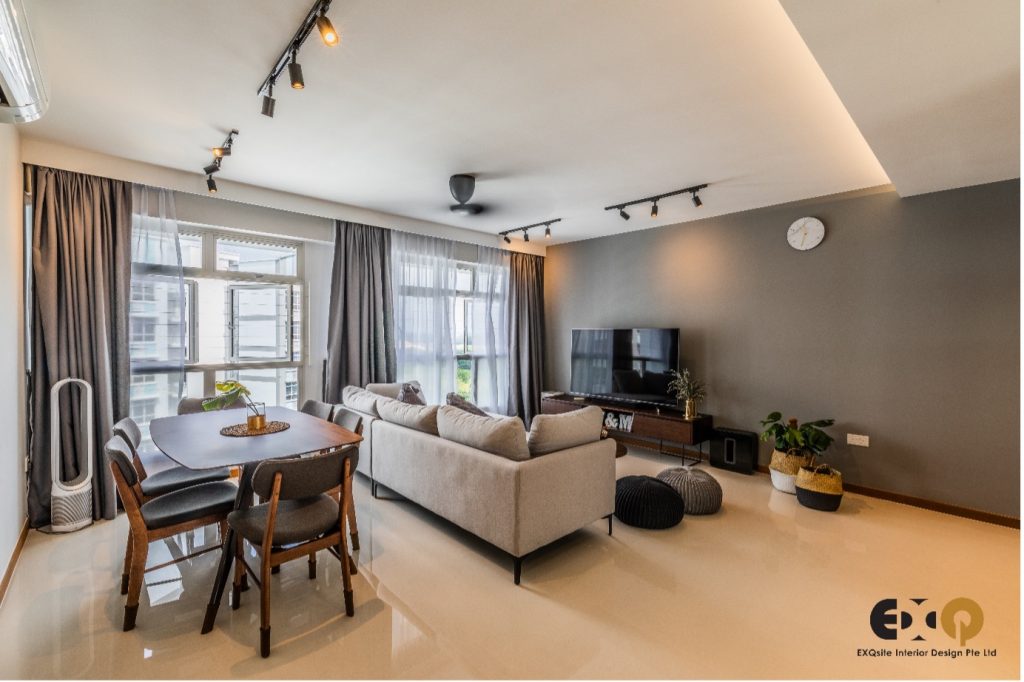
A gorgeous setting of modern living etched in chic tones of pastel grey is just the home you want to come back to every day. With its low-profile exterior, the home doesn’t need any bells or whistles to make an impactful statement. The beauty of this home is just how classy it looks without even trying. By creating the perfect blend of minimalism and cosmopolitan style, the home avoids looking to bland and drab (a common pitfall of minimalist styles when not executed with finesse) and avoids coming off as over-the-top and looking gawdy.
This home is one of the best examples of a well thought out and brilliantly executed marriage of design and style, making for one of the best renditions of some of the hottest designs and styles which are popular now.

Starting from the living room, the homeowners have chosen to create an open styled living and dining space. The vast expansion of the two combined areas gives you a very wide welcome as you enter the home. Keeping the front entrance empty, the home immediately looks extremely spacious and organized, giving you ample space to navigate around the common areas. The owners of this home have also elected to create a more upbeat living area, creating their own personal bar. With a dining table already in place, it may be a question of why also have a bar?
Dining areas are a typical feature in most homes, the ‘formal’ dining setting is a much stiffer look to homes. Even with the casual features in this dining set, the round table, stained wood style and low back chairs, its hard to escape this archaic association. However, with a bar, you now have a perfectly informal setting for quick meals, or regular meals. Perfect for couples, you have a table for hosting, and a bar for yourselves for day to day use. The smaller and more casual setting makes for a relaxed and comfortable meal.

The bar itself is a handy place, with the minimalist style shelves, the look stays fun and casual, even giving off a little energetic vibe to it. The style here makes it very different from your fathers’ style of a bar. The look is much more modern and appeals to the younger crowd. Even the pendant lights above the bar are a statement piece to the modern look it achieves. Creating the effect of a modern ‘chandelier’, it imbues the bar with a unique personality to give it a modernistic touch of class. Plus, with the backdrop of the liquors on display, it’s a nice decorative touch, even if you aren’t going to be drinking that often.

The study was easily seen from outside, but that’s just half of the room. With the half-wall of glass, the room stays connected to the living room, and this was a great trick too. Typically, the rooms would be walled up, and the wall then decorated with a shelf or something else which decorates the wall. But instead of this, the wall is now a glass panel, and the ‘actual’ background is recessed into the room behind it.

You can now display your bags proudly on the shelf and have them seen right from the living room (to the envy of your guests). Plus, because the wall you’re looking at from the living room is now even further back, the optical illusion makes it such that you think the room is even bigger than what it actually is because the wall is so far behind. Keeping the other half of the wall is also advantageous, since its meant to be a study, the room allows you privacy and the ability to concentrate from the other half, without being distracted by the other areas of the home.

Finally, the sleek design of the kitchen is a sight to behold. With the same dark theming from the entire common area of the home, the kitchen has spared no expense to uphold this look as well. With matte black cupboards and doors, the matching dark wood grains of the countertops create a lustrous look which can rival any penthouse suite. The classy look is created by using light absorbing colours to make for a sophisticated yet muted look. With an understated design, its then easy to pull off a sleek and sharp finish. One other great feature of the kitchen is its ability to convert from open to closed very easily. With a sliding windowpane and door, the kitchen can be closed off for cooking in a blink of an eye. Plus, with the full glass windows, the room is not visually cut off, keeping the kitchen looking spacious and avoids bec

